
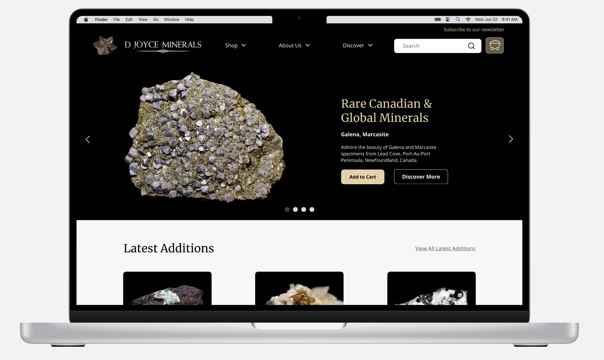
Website Redesign
Website Redesign


Rocking the Redesign: Crafting a Digital Gem
My Role //
UX/UI Designer
Client //
(redesign implementation expected Fall ‘24)
Timeline //
3 Months
Figma Miro Google Workspace Zoom
Tools Used //
Where it began…
This case study details the overhaul of D Joyce Minerals' online store. Tasked with addressing outdated design and user frustrations, I aimed to create a user-friendly website to boost sales and engagement. The transformation process, from research to implementation, resulted in a 13% increase in task completion ease and projected sales growth through improved navigation and product filtering.
TL;DR?
The Process
The redesign process involved comprehensive research and analysis, including user testing, heuristic analysis, competitive analysis, user personas, and journey mapping. This secured full stakeholder buy-in and commitment to the redesign. I created 26 wireframes and introduced 10 new features. Collaboration with the development team was crucial to translating UI designs into code, ensuring consistency and scalability. Enhanced accessibility and performance were achieved by implementing best practices and new technologies.
Accomplishments
I led the redesign, which not only iterated existing pages, but also introduced new features, including:
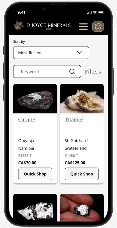
Sophisticated Product Filtering: Created based on user insights and competitive analysis, this feature helps users find products more efficiently, addressing frustrations with the previous design and improving overall satisfaction.
Quick Shop Option: Developed to allow customers to add products to their cart without losing their place on the page, leading to an increase in cart size and enhancing the shopping experience by making it more seamless and convenient.
FAQ and Policy Pages: Established FAQ, shipping policies, return policies, and a contact us page to enhance trust and provide easy access to important information. This addresses customer concerns and improves transparency, making the site more user-friendly.
My retail and e-commerce experience guided strategic business decisions, validated through research, ensuring stakeholder alignment and supporting business objectives.
Learnings
This project highlighted the importance of user-centered design, effective collaboration, and aligning UX insights with business goals for impactful results.
So, what’s the problem?
❌ The current website has a risk of losing competitiveness in the market.
❌ The interface lacks modern features and design elements.
❌ The brand's image needs enhancement to justify higher prices.
💪🏼 Updating the website without compromising the company's values and identity presents a challenge.
🤔 How might we revitalize the D Joyce Minerals website to appeal to a broader audience while upholding its heritage and maintaining its loyal customer base?
What a difference change makes
Single Ease Question (SEQ)
13% improvement in the SEQ average, before and after the redesign
System Usability Scale (SUS)
10% increase in the SUS, before and after the redesign
User testing showed measurable design improvements using the Single Ease Question (SEQ) and System Usability Scale (SUS), providing a thorough pre- and post-redesign comparison. Post-launch, I'll evaluate sales and KPIs to assess further progress.
Stakeholders were highly satisfied with the outcomes, approving the redesigns for implementation. These changes are expected to significantly enhance brand perception, increase customer retention, and drive business growth.
Discovery
Don’t start anything without a plan
Before diving into the redesign process, I prioritized understanding the strengths and weaknesses of the current website. To achieve this, I devised a comprehensive plan to gather valuable insights. Each methodology built on the previous one, ensuring a thorough understanding of the "why," "who," and "how" behind user behaviors and needs.
Methodology and Rationale
Stakeholder Interviews: Conducted initial interviews to align on business goals and gather preliminary insights.
Proto Personas: Developed proto personas based on stakeholder interviews and preliminary research to represent key user groups.
Heuristic Analysis: Evaluated the current website against established usability principles to identify obvious usability issues.
User Testing: Performed usability tests to observe real-time interactions and identify specific usability issues.
Journey Mapping: Created journey maps to visualize the user experience and identify pain points and opportunities throughout the user's interaction with the site.
Competitor Analysis: Analyzed competitor websites to identify best practices and areas where the current site could be improved.
Prioritization Matrix: Used a prioritization matrix to evaluate and prioritize the findings and recommendations based on impact and feasibility.
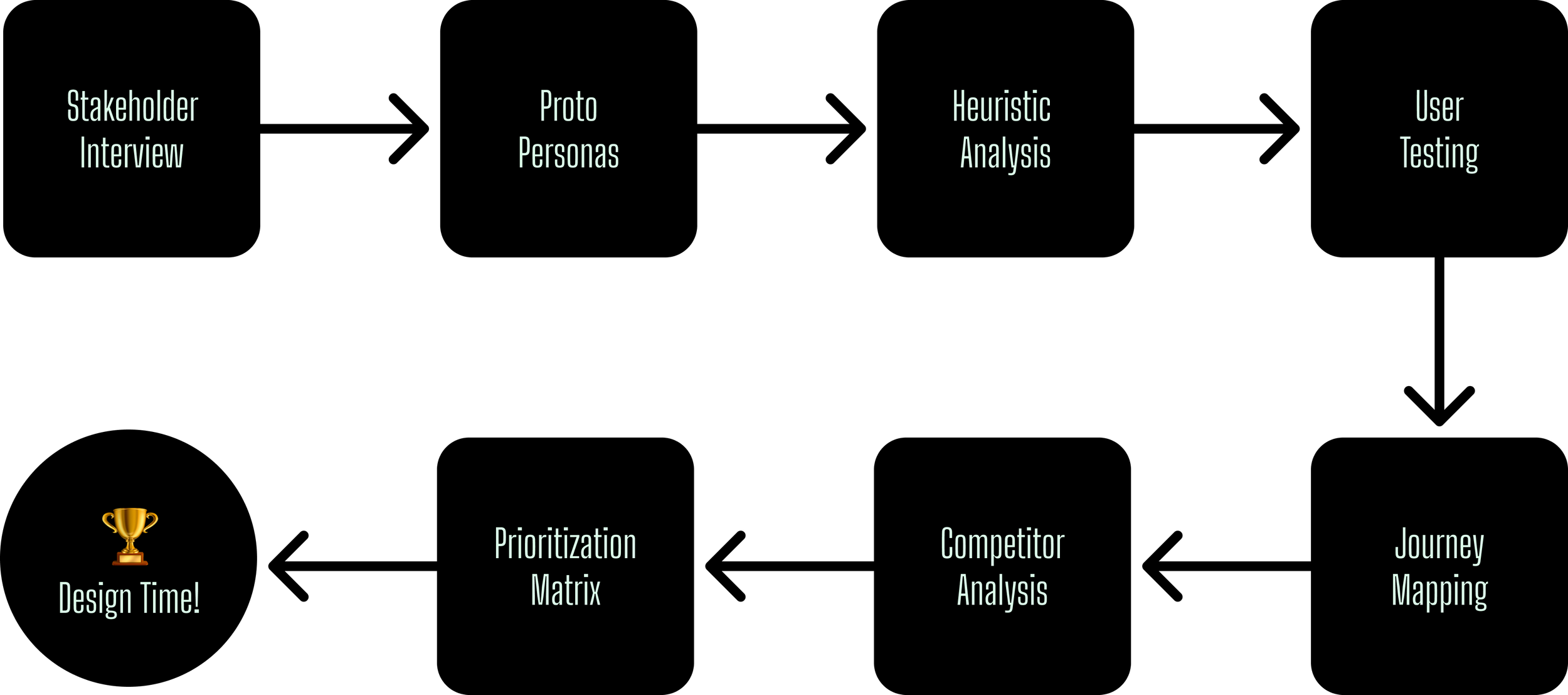
Now, let's look more in depth at some of the methodologies I used, and how they contributed to my design solutions. . .
Who are the users?
After chatting with stakeholders, I got a good grip on who's already shopping and how they do it, plus who we're hoping to attract next. Using this information, I developed proto personas: one representing the current customer base and the other the prospective customers we aim to attract. This step was crucial for tailoring our approach to meet both current and future user needs effectively.
Let’s meet our actors!
Mason Quarry - Current Customer
Mason is an avid mineral enthusiast with extensive knowledge in the field. He has been loyal customer of D Joyce Minerals. He values detailed product information and would like a seamless shopping experience.
🤔 How can we ensure that the website updates enhance, rather than disrupt Mason’s shopping journey?
Sandy Shale - New Customer
Sandy Shale is a newcomer to the world of minerals, lacking the extensive knowledge of enthusiasts like Mason. However, he is intrigued by minerals and eager to learn more.
🤔 How can we ensure that users like Sandy can easily search, navigate, and make purchases?
🤔 How can we establish trust and encourage their engagement with the brand?
Sandy will be the primary persona for the design considerations.
The goal is to ensure his experience is effortless, educational, and memorable, with the aim of turning him into a repeat customer. This doesn't mean we overlook Mason. His input remains valuable, and I will continue to consult with him to ensure the designs cater to his needs as well.
With these personas, I'm ready to dive deeper into discovery. Knowing exactly who I’m designing for targets my research and brainstorming to discover solutions that fit just right for them.
Current outlook- not so good
I examined the D Joyce Minerals website from the perspective of each proto persona.
🤔 How would they use the site as it is now?
My goal was simple: find any issues and make the user experience better. The heuristic analysis helped me spot problems and find ways to improve, all to create a smoother experience for the user, that will lead to increased sales and conversion. By checking how well the site follows basic usability rules, I found areas I can make better for our users.
Let's see how the homepage measures up:
1. Reduce links in navigation bar. Create simpler primary nav. Increase font size.
2. Make cart larger/more clickable, 45x45px min. Remove $ and items, for simplicity.
3. Reduce the width of the search bar. Move placement to top, left of shopping cart
4. & 5. Move social media links and email to footer, not a priority, also current alignment is poor
6. Currently UI is awkward. On mobile, the square covers most of the photos of the specimen. Needs new layout. Will keep carousel.
7. Search bar already exists in nav bar. Keep nav bar sticky to allow access to search bar at all times.
8. Update value prop copy. Try to list items in denomination by country if possible. Will need to have users denote their location. Otherwise, denote CDN next to prices. Too complicated to ask users to do the math. Where are the majority of cx located? If in Canada, keep, if in US, consider changing prices to USD.
9. Is copy accurate to 100 most recent? Very wordy for a button. Could be simplified, and different placement?
10. Create a carousel, to show more new products. End with “View more” link. Not enough product shown.
11. Update new listing cards. Does the item number need to be listed here? Instead of add to cart, offer quick view, to allow users to gain more info, and not navigate away from page.
12. Consider a pop-up upon arriving at page to invite users to join the mailing list. If not, layout needs to be improved. Text and input fields
need to be aligned.
13. Add logo/home link to footer. All links are already in the nav bar. Consider what content is needed here.
14. Remove background image, stakeholder wants different colour theme overall, may not match.
But what do people think?
I conducted remote moderated testing with 5 users to understand their interactions, frustrations, and preferences on the current website. Targeting users similar to Sandy Shale—experienced in e-commerce but not in mineralogy—mirrored our potential customer base.
Each participant completed 10 tasks, reflecting Sandy's journey to find a new mineral for their office. This approach was chosen because it provided direct insights into the user's decision-making process and highlighted usability issues that could impact their experience. The tasks were designed to incorporate concerns from the heuristic analysis, allowing me to observe user interactions with key elements and ensure my recommendations were grounded in real user behavior and pain points.
Insights
〰️
Insights 〰️
Participant Quotes:
"I get a mom and pop vibe from the site. It feels like a hobbyist's passion project, aiming for that personal connection."
"The navigation is simple, but there's too much text on the page. It's overwhelming."
"Having filters would make exploring so much easier. I prefer to search and find what I want immediately."
"I'm a bit lost on the Minerals page. Is this a list of sources or something else? It's hard to focus with this long list."
"Feels independent and small. It feels homemade."
🔑 User testing revealed the website felt like a personal project rather than a professional platform, with a "mom and pop" vibe. Participants wanted filters for easier exploration and immediate search results. Navigation was simple, but excessive text, especially on the Minerals page, made it confusing. Overall, users perceived the site as small-scale and homemade.
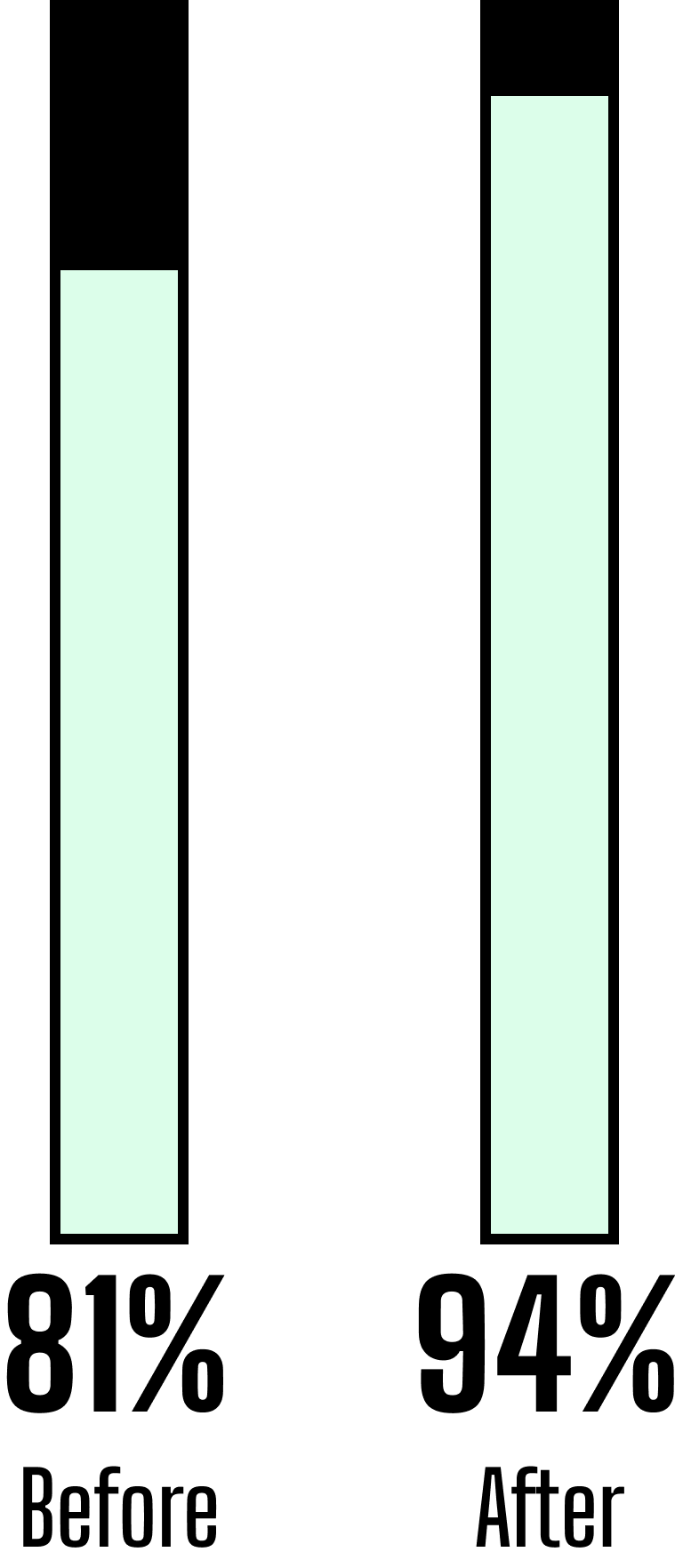
SEQ and SUS Scores
To obtain quantitative feedback, I used the Single Ease Question (SEQ) for task-specific ratings and the System Usability Scale (SUS) for overall usability. SEQ provides quick insights into task difficulty, while SUS offers a broad view of user satisfaction.
Scores averaged 81% for SEQ and 85% for SUS, indicating room for improvement due to user frustration.

Now that user testing is finished, I can begin crafting detailed journey maps tailored to our proto personas.
The journey of Sandy Shale
This journey map explores the experience of new customers, like Sandy Shale, at D Joyce Minerals, revealing crucial insights into their needs and challenges.
This process reinforced the importance of empathetic design and aligning business goals with user expectations, guiding more strategic decision-making.
Let’s zoom in on the journey...
Sandy Shale's Experience with the Site
Sandy found the website outdated and difficult to use, citing the lack of product filters and challenges in finding information. While somewhat satisfied with the information provided, Sandy wanted more details and shopping opportunities. Despite trusting the owner's expertise, Sandy hesitated to complete the order due to insufficient information and perceived security issues with the payment process.
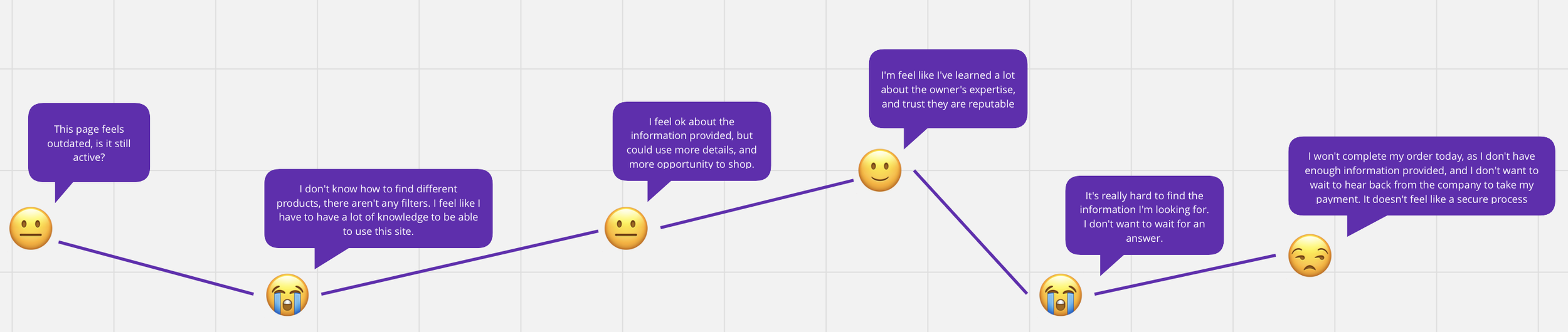
More insights from Sandy Shale's experiences:
Provocations
How might we address user needs and obstacles?
Ideas
What feature ideas do we have for each stage?
By examining Sandy's progression alongside the insights, provocations, and ideas at each step of his experience, I started identifying the critical areas needing enhancement. These are inclusive of, but not limited to:
💡 Enhance branding and engagement.
💡 Improve visual appeal.
💡 Implement filtering and sorting.
💡 Enhance accessibility.
💡 Provide clear error messages.
💡 Introduce user-friendly FAQ.
💡 Enhance navigation.
💡 Optimize checkout process.
💡 Prominently display policies.
💡 Include educational content.
Information Architecture
The initial research is complete. What’s next?
I've got a solid understanding of the stakeholder's requirements, our current user base and target audience, how users feel about the site, and what strategies other e-commerce sites are employing.
That's a good start!
However, I can't jump into design just yet. First, I need to play the role of an architect and draft a new plan.
🤔 How can we make the navigation better?
🤔 What might a new user's journey through the site look like?
Let's see how this maps out. . .
Getting around the site
The current site map is cluttered, making navigation overwhelming. To improve usability, I'll implement dropdown menus for better organization and add new pages like "Shop All Minerals."
Logistical constraints prevented an open card sorting exercise, so I collaborated with the stakeholder to confirm essential elements and establish an ideal hierarchy based on user behaviors.
Here is the updated sitemap:
Go with the flow
I analyzed Sandy Shale's navigation behaviors on the website using insights from his journey map and user testing. Based on this analysis, I created wireframe sketches to optimize his navigation, clicks, and scrolling patterns, ensuring a streamlined experience to achieve his goals on the updated website.
The new user flow:
Lo-Fi
Design time!
With research and information architecture done, I'm now ready to sketch out the basic website layout.
Starting with lo-fi solution instead of detailed ones lets me try out ideas faster. It helps catch any problems early on and saves valuable time.
These designs include pages like the main landing page and new shopping sections such as "Shop All Minerals," "Latest Arrivals," and "Featured Minerals." This is a turning point where planning turned into real design, setting the stage for refining and testing with users.
-
![]()
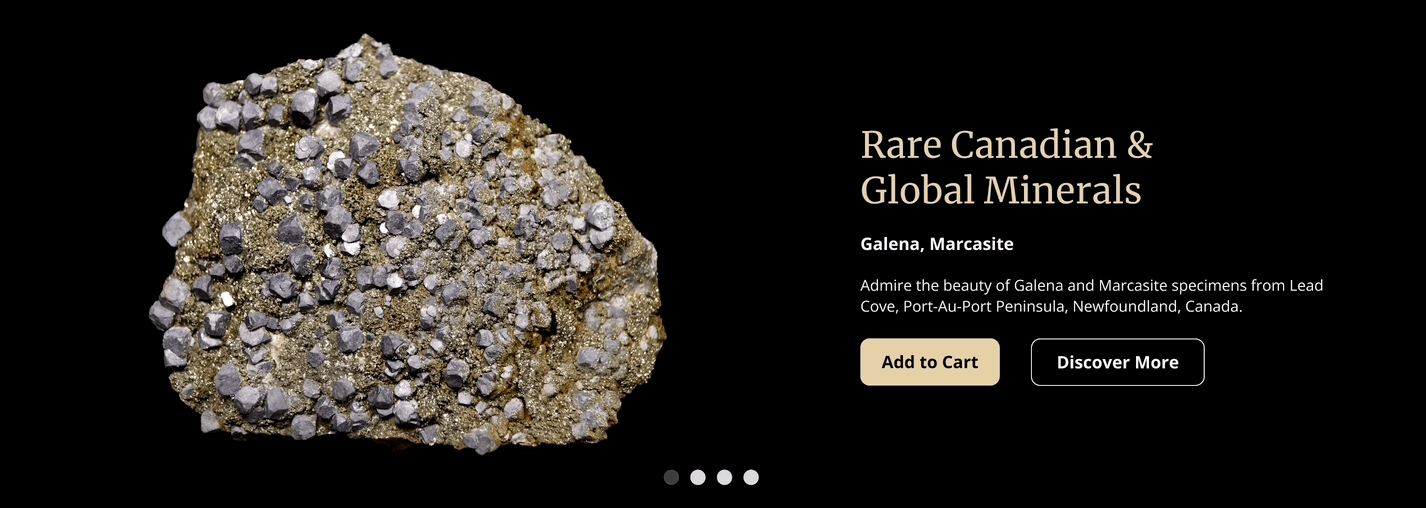
Homepage
-Created distinct sections.
-Introduced a carousel for showcasing the latest additions to the shop.
-Incorporated a card highlighting a featured mineral collection.
-Allocated space to highlight the expertise of the company's owners through an enhanced value proposition.
-
![]()
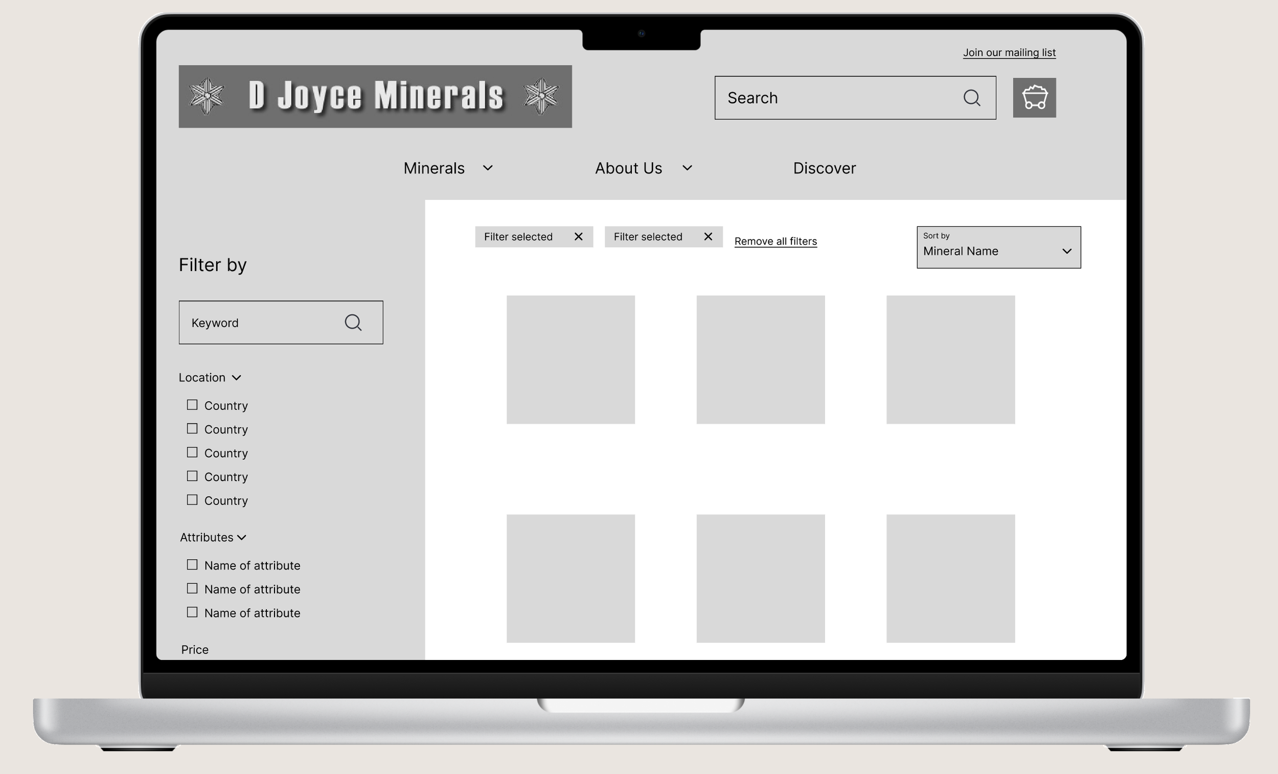
View All Minerals
-Introduced as a new page.
-Implemented a filter system enabling customers to narrow down options by locality, attributes, and/or price.
-Added a "Sort By" drop-down menu for sorting options such as newest, alphabetical, or price.
-
![]()
Latest Arrivals
-Incorporated a "Sort By" drop-down menu for enhanced user sorting.
-Ensured consistency in card sizes for a more cohesive look.
-
![]()
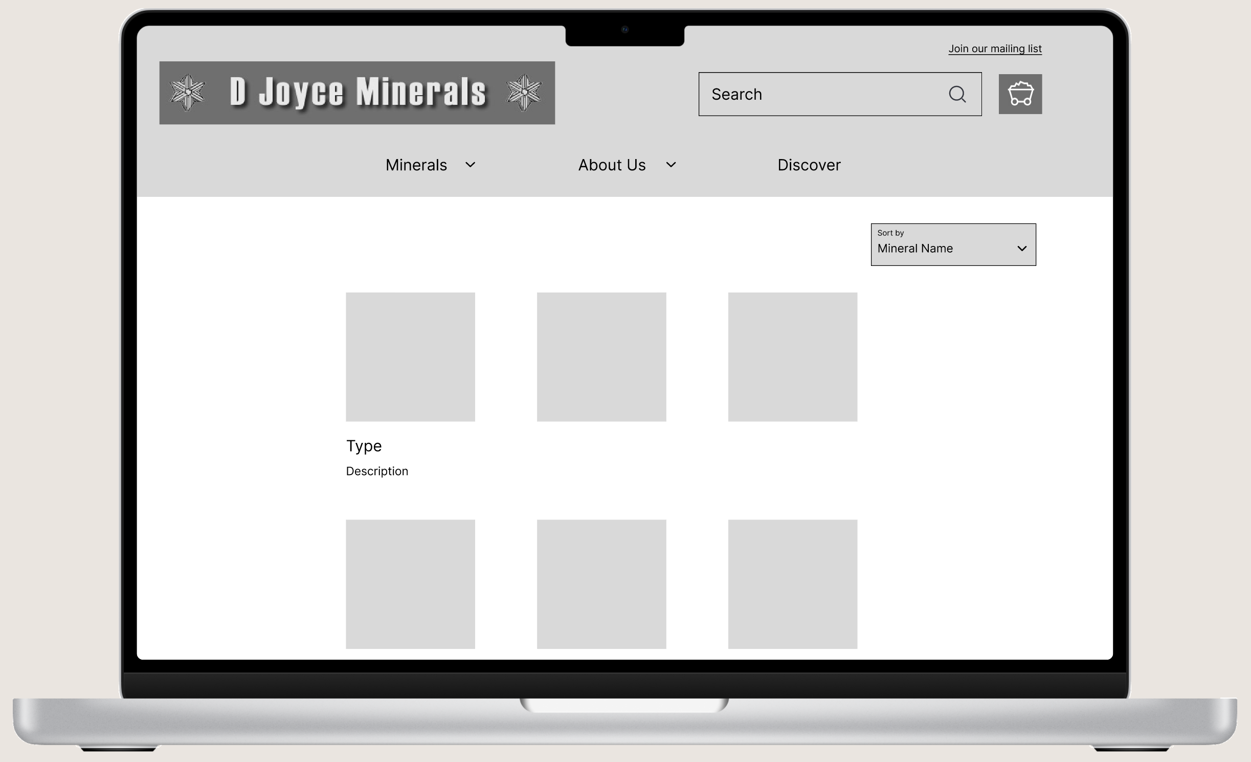
Featured Minerals
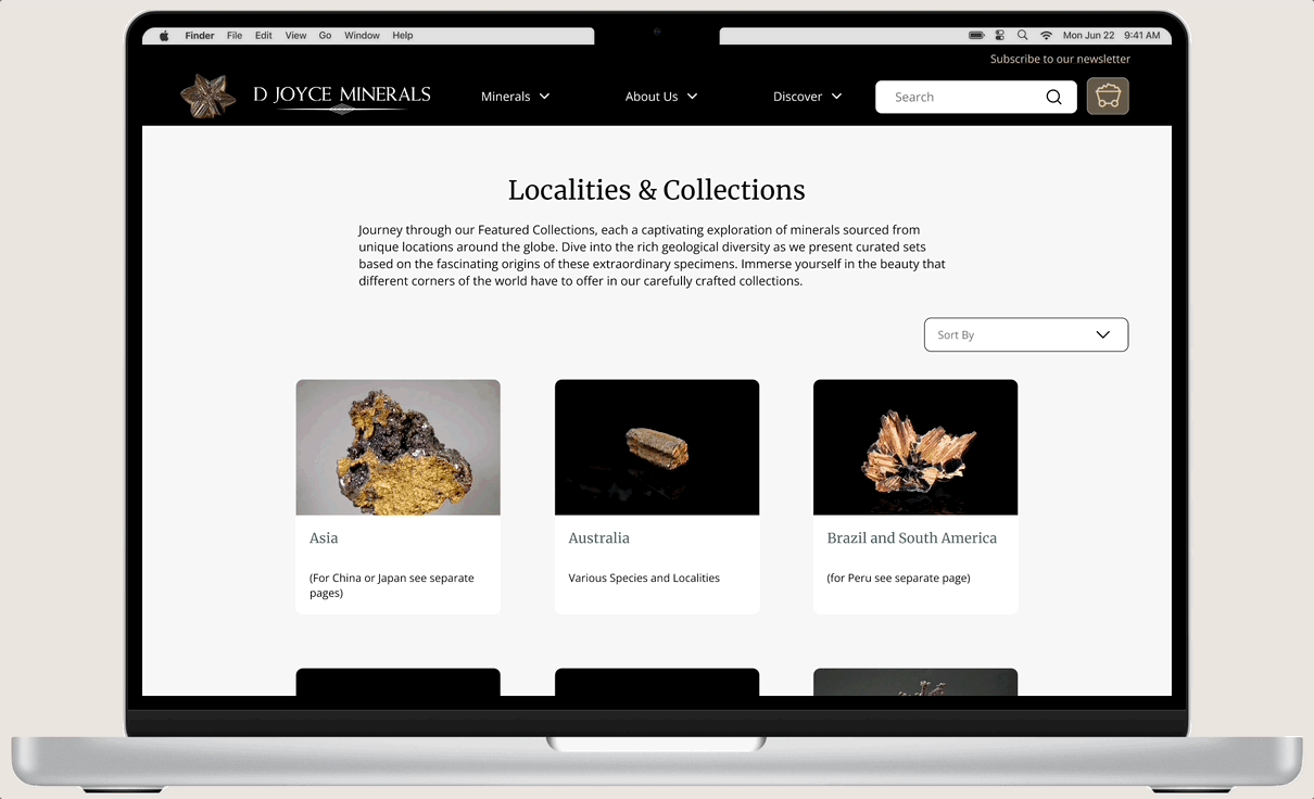
-Replaced the previous "Minerals" page.
-Transitioned from a wall of links to curated cards showcasing collections.
-Each card includes an image, description, and title for better visual representation and understanding.

Once I finished the basic designs, I met with the stakeholder to review them and make sure they were on track. Once he gave the green light, I started working on the branding before moving on to the hi-fidelity designs.
Branding
Creating a new face
Brand Identity
In my initial sit-down with stakeholders, I delved into the owner's vision and the vibe they wanted for D Joyce Minerals. This conversation sparked the creation of a voice chart—a roadmap that steered every design decision moving forward.
The redesign of D Joyce Minerals centers on expertise, natural beauty, and community. It's about showcasing the brand as a trusted authority in minerals while celebrating their captivating allure. Beyond that, it's about building a community where enthusiasts and customers feel at home.
Here’s a peek at the voice chart:
Brand Guidelines
Brand guidelines are crucial for keeping D Joyce Minerals' look and feel consistent everywhere—from websites to print materials. For this website redo, we nailed down the color palette, fonts, logo design, and imagery style, all in line with the brand's unique voice.

The colors #E5D1A6 and #395F67 are used for links and buttons to align with the refreshed brand identity, signifying expertise, reliability, and natural elements. Background (#F7F7F7) and text (#000103) colors ensure readability and accessibility, providing a clean, high-contrast backdrop. These choices enhance usability and aesthetics, reinforcing the brand's voice of expertise, natural beauty, and community.

Merriweather was chosen as the header font for its classic, elegant appearance, which aligns with the brand's expertise and reliability.
Open Sans was selected as the body font for its readability and modern aesthetic, ensuring clear communication of content across the website.
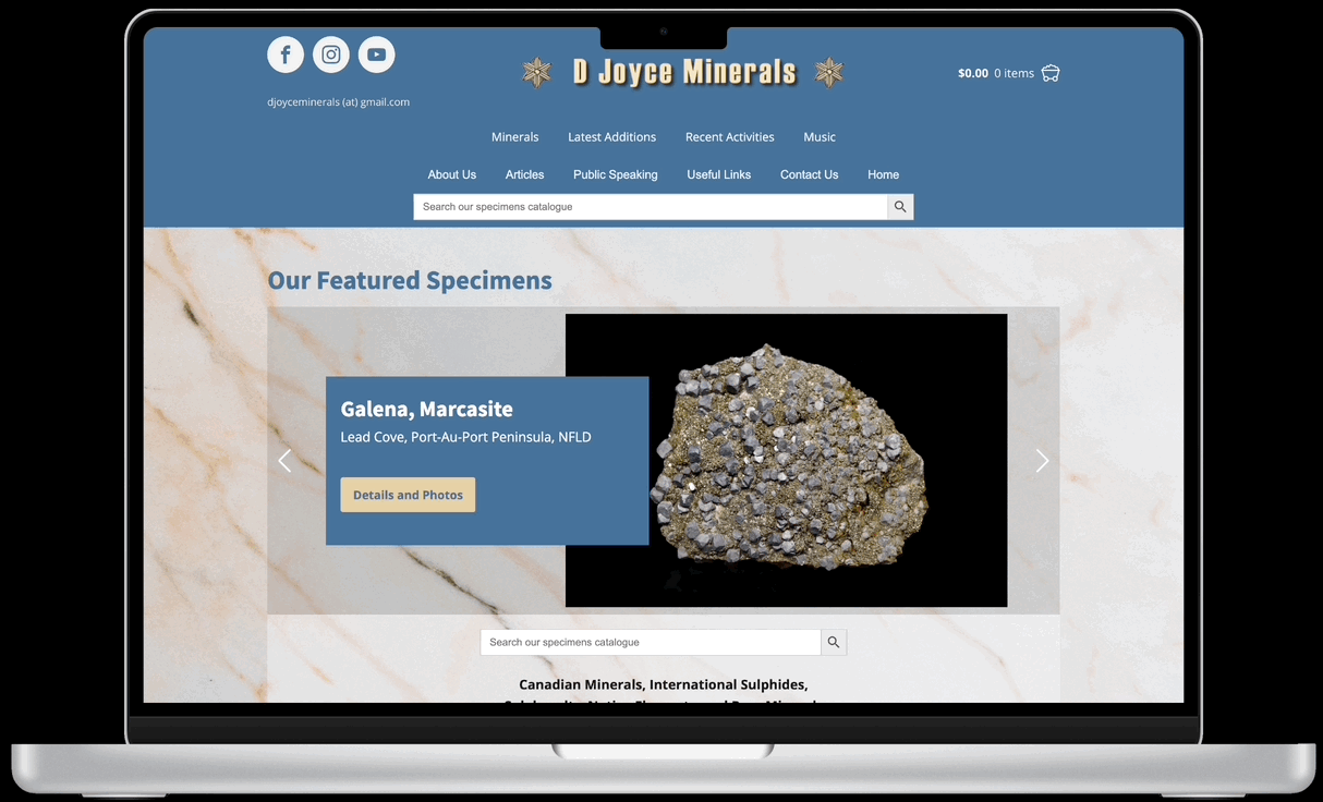
BEFORE
AFTER

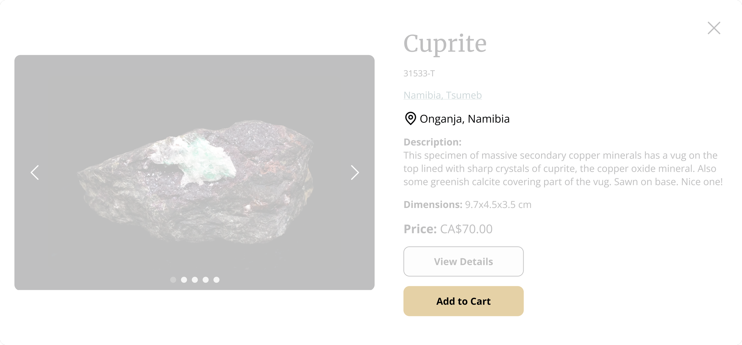
The revamped logo, featuring a sophisticated typeface, expresses professionalism and reliability. It now uses an authentic photograph of the Curprite mineral instead of a drawn depiction, enhancing realism and better representing the brand's natural beauty. Retaining the Curprite mineral pays homage to the original branding, preserving the company's heritage.
Hi-Fi (First Iteration)
Now in Colour!
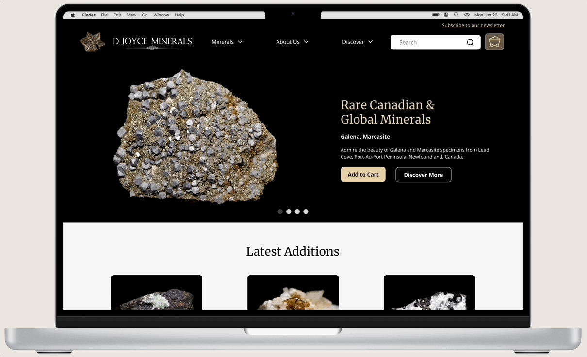
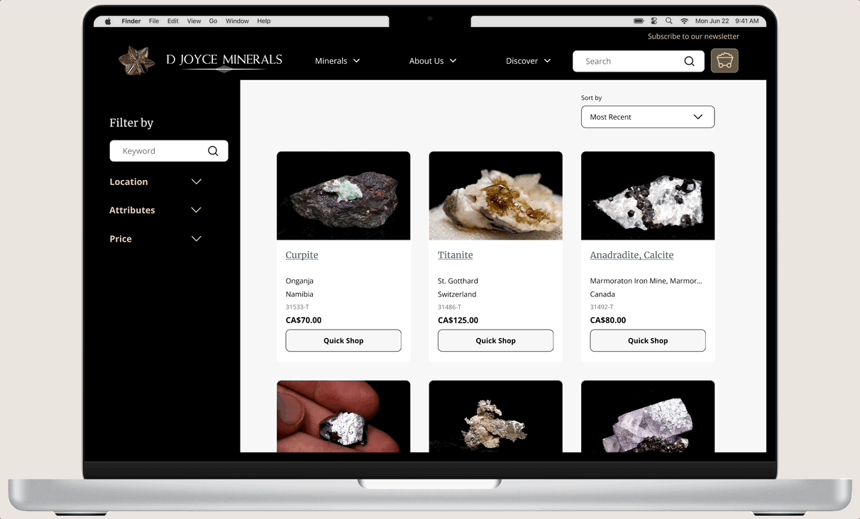
I began with high-fidelity designs for the homepage, presenting it to the stakeholder for approval. After minor adjustments based on feedback, I passed it to the developer for feasibility checks. Following further iterations, I proceeded with comprehensive website design. The project involved redesigning over 20 responsive pages for both desktop and mobile platforms, ensuring a seamless user experience across devices.
-
![]()
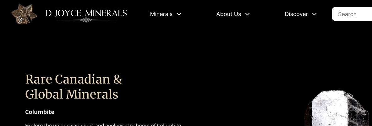
Homepage (Updated Page)
-
![]()
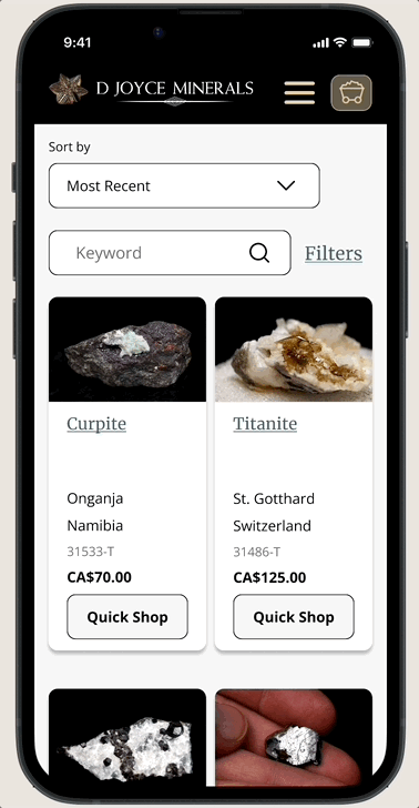
View All Minerals (New Page)
-
![]()
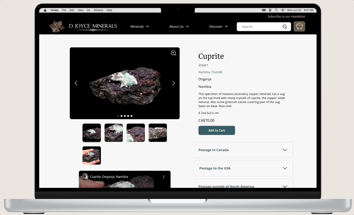
Item Details (Updated)
-
![]()
Localities & Collections (Formerly "Minerals" Page)
-
![]()
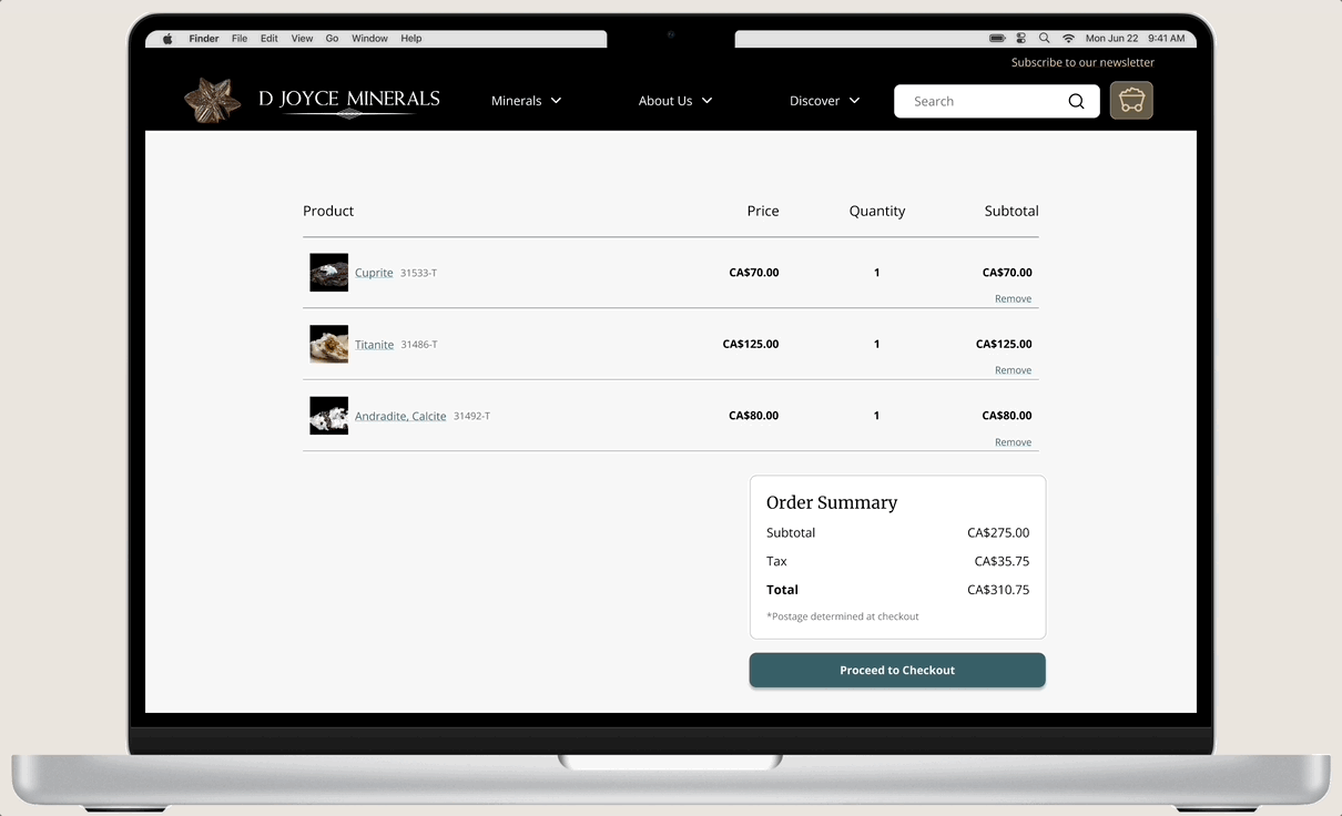
Cart (Updated Page)
-
![]()
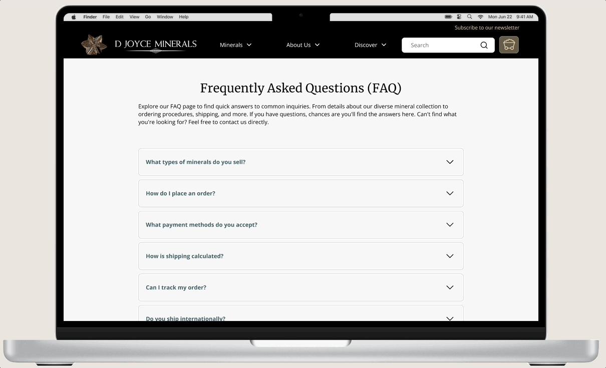
FAQ (New Page)
-
![]()
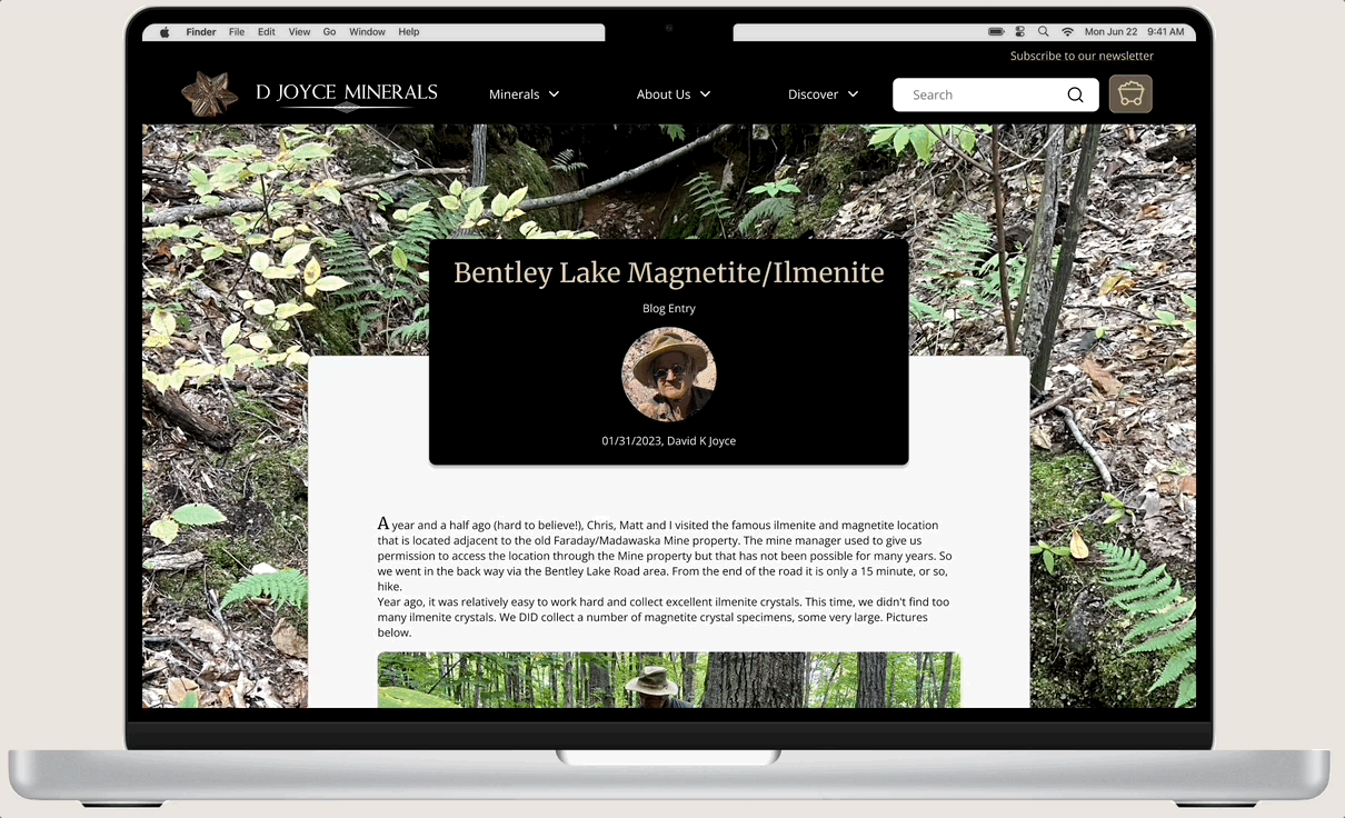
Blog/Article Entry (Updated)
-
![]()
Navigation (Updated)
-
![]()
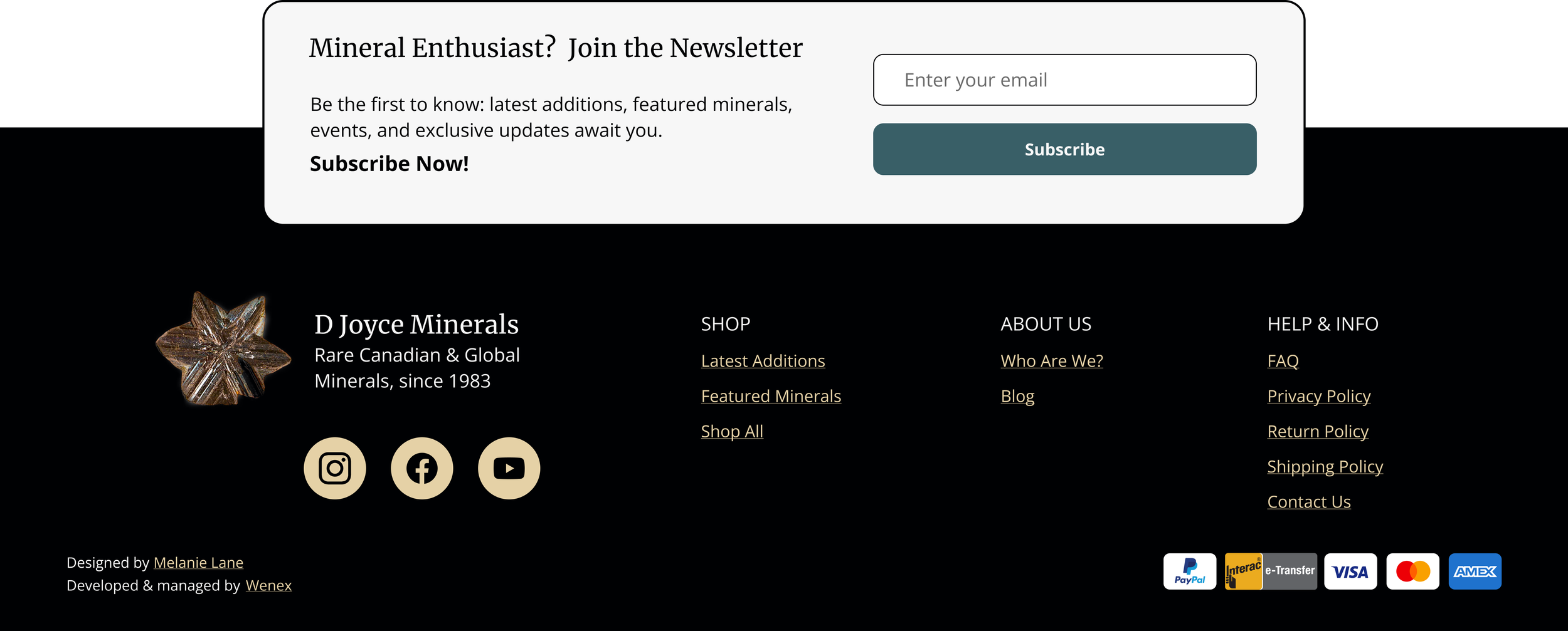
Footer with Newsletter Sign Up (Updated, Newsletter New)
-
![]()
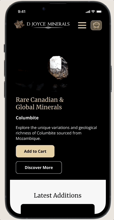
Mobile Navigation & Homepage
-
![]()
View All Minerals & Filters
With hi-fidelity designs complete, it’s time to discover what users think of the new and improved website. . .
User Testing & Iterations
Putting it to the test
I conducted remote moderated user testing with 5 participants after developing high-fidelity prototypes to validate the design's usability. This approach was crucial for gaining insights into how users interacted with the website, particularly those with online shopping experience but limited knowledge of mineralogy, akin to Sandy Shale. By testing early, I aimed to identify usability issues and gather feedback to refine the user experience before the website's launch.
Post-launch, we plan to continue gathering feedback from existing users like Mason Quarry via the newsletter to iteratively improve the site based on real-world usage and feedback.
And now for the results...
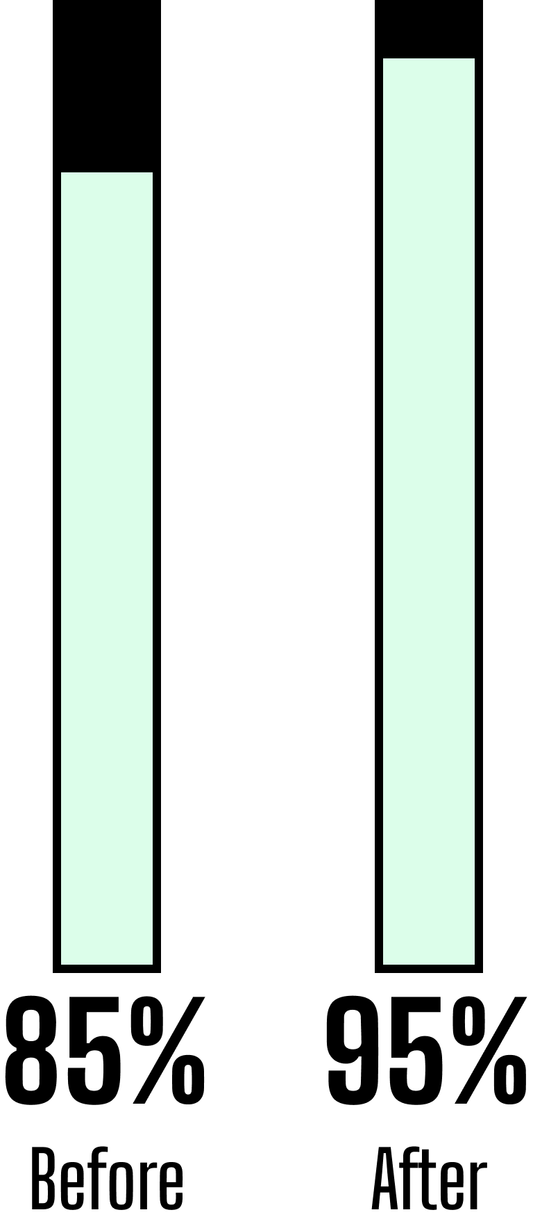
As noted earlier, testing on the existing site yielded an 81% score for the Single Ease Question (SEQ) and an 85% score on the System Usability Scale (SUS).
Upon implementing the new design solution, I observed a 13% increase in the SEQ and a 10% increase in the SUS, signifying a substantial enhancement in the overall user experience.
Single Ease Question (SEQ)

System Usability Scale (SUS)

Mission Accomplished!
Upon asking for their initial impressions of the website, it became evident that the intended voices of "Expertise" and "Natural Beauty" resonated strongly with the users. They no longer perceived the business as a mere mom-and-pop operation but rather as an established, knowledgeable, and trustworthy entity.
Participant Quotes:
"The design looks clean overall, giving off an established vibe. It validates reliability, suggesting that the company is invested."
“The business has a legacy."
“The site is straightforward and informative.”
“Minerals are the hero”
Yet, there is still room for improvement
Despite seeing a big improvement in user feedback and successfully updating the website to match the stakeholder's vision, users still highlighted some tricky areas.
Before making any changes, I used a prioritization matrix to figure out which improvements were vital, based on value vs effort. I also paid attention to the individual SEQ scores, noting where scores were lower for different tasks.
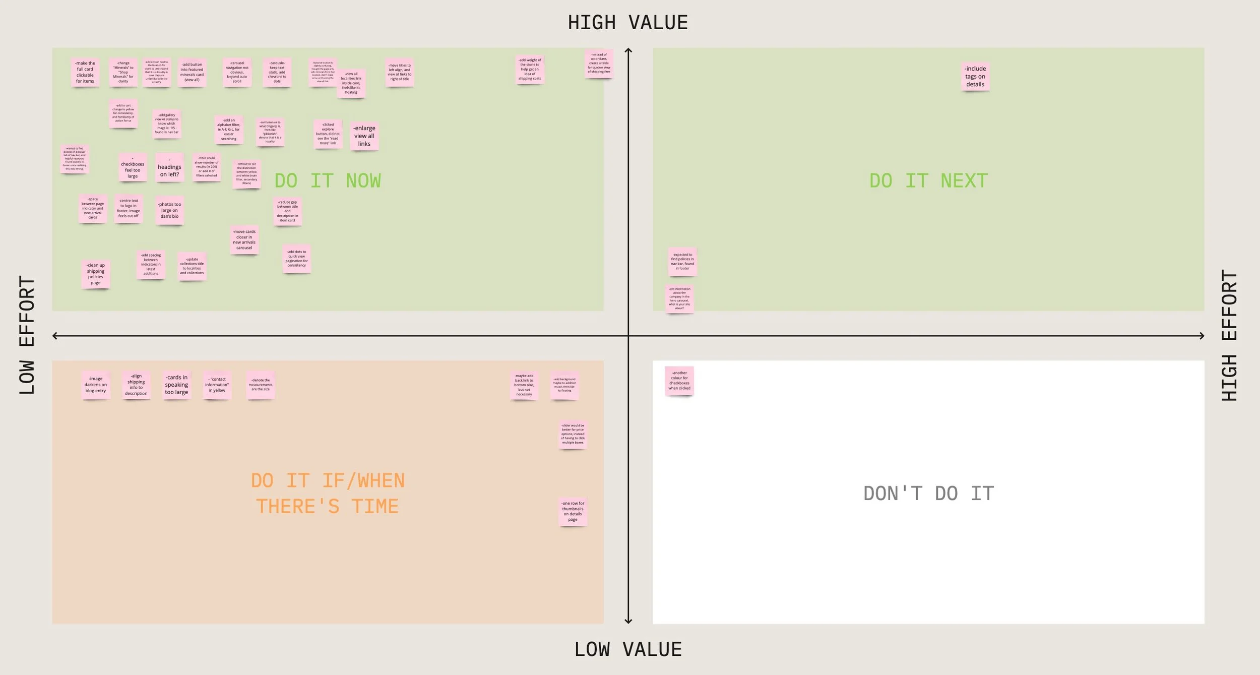
Zooming in on these sticky notes, we can focus on some of the key updates to the homepage:

While users could navigate to shopping options, they often hesitated about the content under the "Minerals" tab in the main navigation.
Solution: Changing the label to "Shop" ensures users have a clear understanding of what to expect within this dropdown menu. Since the website mainly sells minerals, it's crucial to use explicit language indicating the shopping area.
BEFORE
AFTER
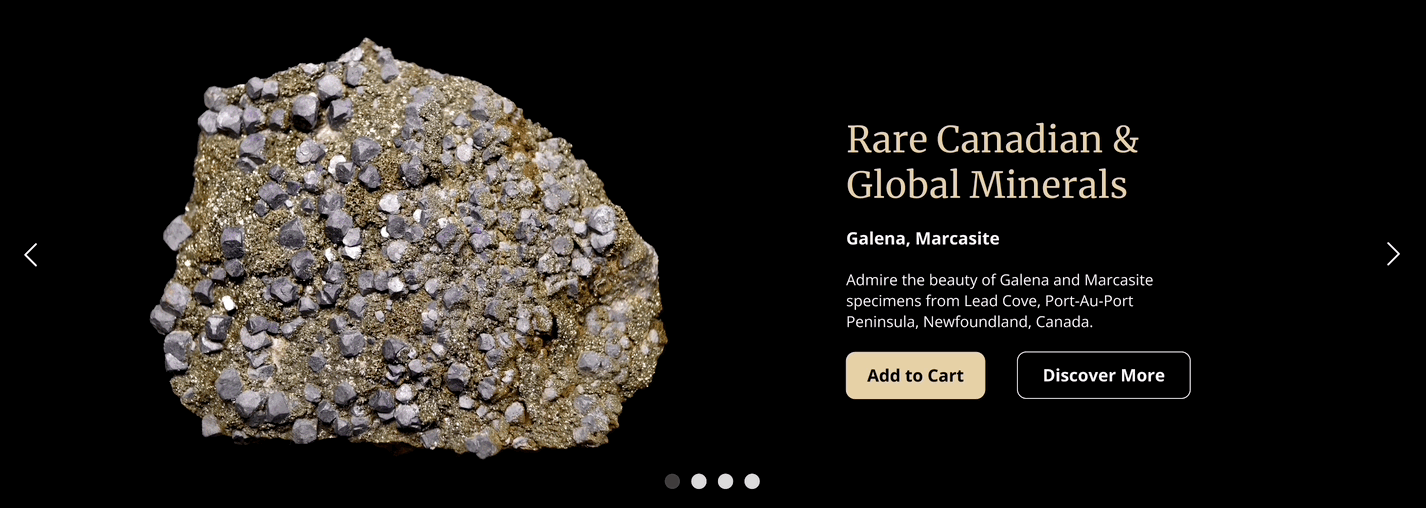
Solution: I made the text and image placement static, with only the image and copy changing from slide to slide.
Additionally, I added chevrons on either side of the banner to indicate that users can scroll, while still keeping the dot pagination clickable. This gives users multiple ways to navigate through the hero space.

Solution: I aligned the title to the left and the link to the right. This adjustment also aligns with the layout of the existing website, providing familiar navigation for long-term users.
Additionally, I reduced the spacing between cards, which allowed room for a fourth, increasing products showcased.


Solution: I moved the link into the card, improving clarity and navigation.

Solution: I introduced a new button labeled "Learn More About Us" placed above the shopping button. I retained both options to provide customers with multiple paths to access the products.

Solution: All “Add to Cart” and any buttons relating to purchasing were updated to wheat to have a greater impact, potentially leading to increased sales and improved navigation.
To clarify its meaning, an icon indicating its status as a location was added.
Dev Handoff & Design System
Time to pass the baton
To ensure smooth operation, I developed a comprehensive design system with over 50 elements, following Atomic Design principles. This simplifies the developer's work, supports seamless updates, and maintains brand consistency. Additionally, I added notes to components and wireframes using Figma's Dev Mode for clear guidance. The developer has started coding based on these designs, and I am available to assist with any queries or tweaks required.

Final Product
Final Thoughts
Here is where the story ends, for now. . .
Revamping D Joyce Minerals' website has been enlightening and rewarding. Through meticulous research, thoughtful design iterations, and collaborative efforts, I've created a more engaging and user-centric online experience. It's inspiring to see the project evolve from its initial stages to a comprehensive solution that balances modernization with the company's rich heritage. I'm confident the new website will exceed the expectations of both existing and potential customers.
Next Steps
While the website redesign is a significant achievement, it's just the beginning of continuous enhancement. Next steps include:
Gathering feedback from users like Mason Quarry via newsletters or pop-up surveys after the update.
Monitoring key performance indicators to assess the website's effectiveness.
Expanding our digital presence with targeted marketing to increase brand visibility and attract new customers while nurturing existing relationships.
Personal Learnings
Looking back at this project, it's clear that putting users at the center of our design approach is crucial for creating digital solutions that really hit the mark.
Working closely with stakeholders and the development team was key to getting everyone on the same page and reaching our project objectives.
Staying flexible and adaptable as I tackled different design challenges helped navigate rough waters and seize opportunities for innovation along the way.
One challenge I encountered was not getting direct feedback from existing clients before the website update. Relying only on stakeholder insights made me realize the importance of hearing directly from users during the design process.