
From Woofs to Wows: Unleashing a User-Friendly Experience for TEAM Dog Rescue's Website


Project background
Our group project redesigned the website of TEAM Dog Rescue, a foster-based charity for homeless dogs. The existing website had usability issues, frustrating users and deterring potential adopters. To enhance user experience, increase adoptions, and boost donations, we proposed a redesign with improved navigation and a streamlined layout.

UX Research
UX & UI Design
Team project
My Role
Figma, Google Workspace,
InVision
Tools
The Problem
The TEAM Dog Rescue website presents notable usability challenges identified through our analysis. A purposeful redesign, prioritizing intuitive navigation and streamlined information delivery, is imperative. Our goal is to not only rectify these issues but to foster elevated user engagement and heightened financial support. How can we strategically execute a website overhaul that not only enhances usability but also substantially increases user interest and contributions?
The Solution
In response to usability issues hindering user engagement on the current TEAM Dog Rescue website, our solution involves a collective effort to revamp the site. My direct contributions played a pivotal role in achieving our goals:
As a team leader, I facilitated efficient project management with a Kanban Board.
I actively contributed to heuristic analysis, identifying and solving usability issues.
Conducted user testing and analysis, gathering invaluable insights for the redesign.
Collaborated on the UX/UI design for a more user-friendly experience.
I redesigned the main navigation bar and footer for web and mobile platforms.
Revamped the “You” page layout, a key page, to enhance user engagement.
These efforts will lead to an improved user experience, an increase in adoption applications, and a boost in donations for TEAM Dog Rescue, ultimately making a positive impact on their mission.
The Impact
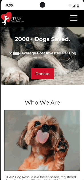
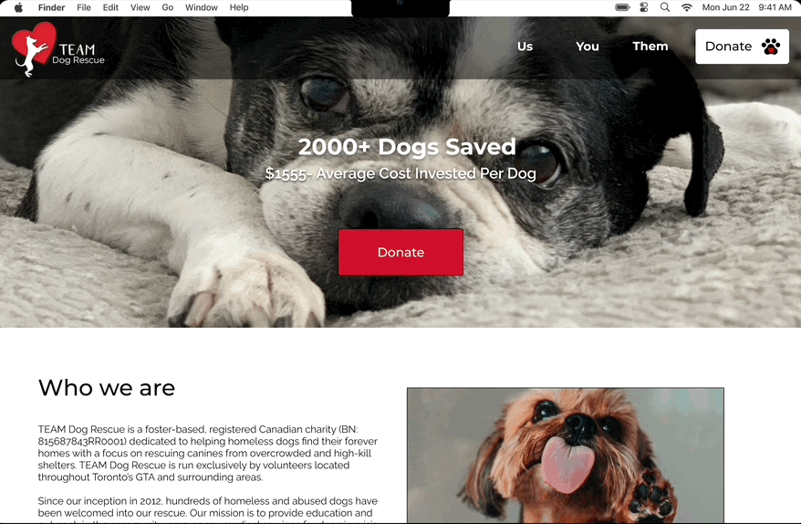
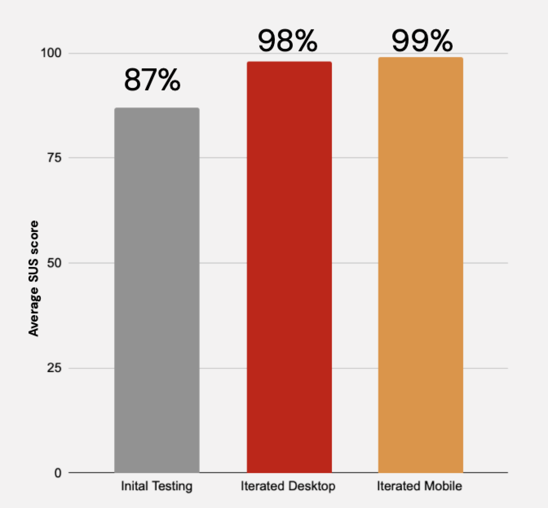
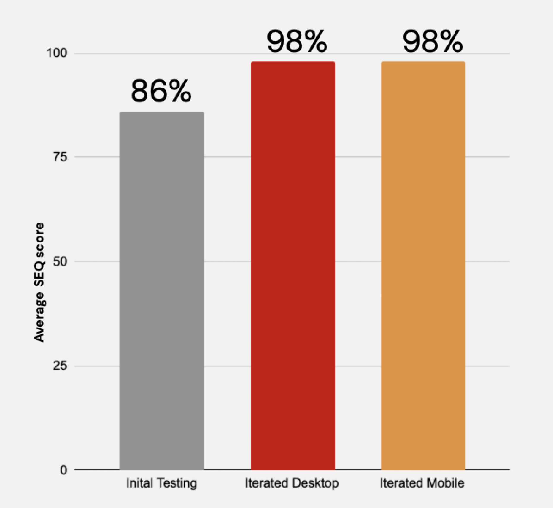
The redesign of the TEAM Dog Rescue website yielded positive results, improving the user experience through enhanced navigation and layout. This led to increased usability and reduced user frustration. Anticipated outcomes include a rise in adoption applications and a boost in donations. Final user testing demonstrated significant progress, with an 11.5% increase in the System Usability Scale (SUS) score and a 12% improvement in the average Single Ease Question (SEQ) score.

Before redesign
Initial overall System Usability Scale score
Initial average Single Ease Question score

After redesign
The average score of the SEQ saw an 12% increase
The SUS score experienced a growth of 11.5%
The Process

Empathize
Heuristic Analysis
We performed a heuristic analysis of the website to identify usability issues and determine its current strengths. Based on this analysis, we developed hypotheses for areas that needed attention in our redesign. The global navigation caused confusion, and the layout lacked coherence and intuitiveness. The content was not clearly divided or grouped for easier consumption. Our goal for the redesign was to create a comprehensive platform that connects adoptable rescue dogs with potential adopters through user-friendly navigation, informative profiles, and streamlined adoption processes.


Confusing navigation system. Easily missed secondary navigation, font small and color not accessible with background photography.
We also completed a competitor analysis, and examined websites such as the Ontario SPCA website, which offers vital features such as education, adoption, volunteering, and donations to support animal welfare.
We conducted a survey to gather insights from individuals regarding their experiences with dog rescue and their expectations from a website for such an agency.
User Test
Using remote moderated testing, we conducted six user interviews to evaluate the website.
Participants answered introductory questions about animal rescue experience, completed six tasks on the website, and rated their experience after each task using the Single Ease Question.
They also provided an overall assessment using the System Usability Scale statements. This approach provided valuable insights into usability feedback, pain points, and overall satisfaction.

During our user testing, we found that despite its simplicity, the navigation was not completely straightforward.
Participants were unsure about which elements to click, overlooked secondary navigation, and occasionally lacked confidence in being on the correct page.
Additionally, the layout of secondary pages (Us, You, Them) did not sufficiently provide an intuitive experience for users.
Define
Proto Persona

Sarah Saves is a potential adopter seeking companionship through adopting a dog from TEAM Dog Rescue. We created this user persona to understand the user’s needs, motivations, and challenges. We can tailor the website experience to meet the expectations of individuals like Sarah, ultimately enhancing their adoption journey.
Journey Map
This journey map captures the experience of Sarah Saves, who is in search of a canine companion and explores the website of TEAM Dog Rescue. The purpose of creating this journey map is to gain insights into Sarah's interactions, emotions, and pain points throughout her journey on the website. By understanding her experience, we can identify opportunities for improvement and enhance the user experience for potential adopters like Sarah. This journey map serves as a valuable tool for highlighting areas of frustration, points of confusion, and moments of satisfaction, ultimately guiding us in creating a more user-friendly and fulfilling experience for individuals seeking to adopt a dog through TEAM Dog Rescue.

Ideate
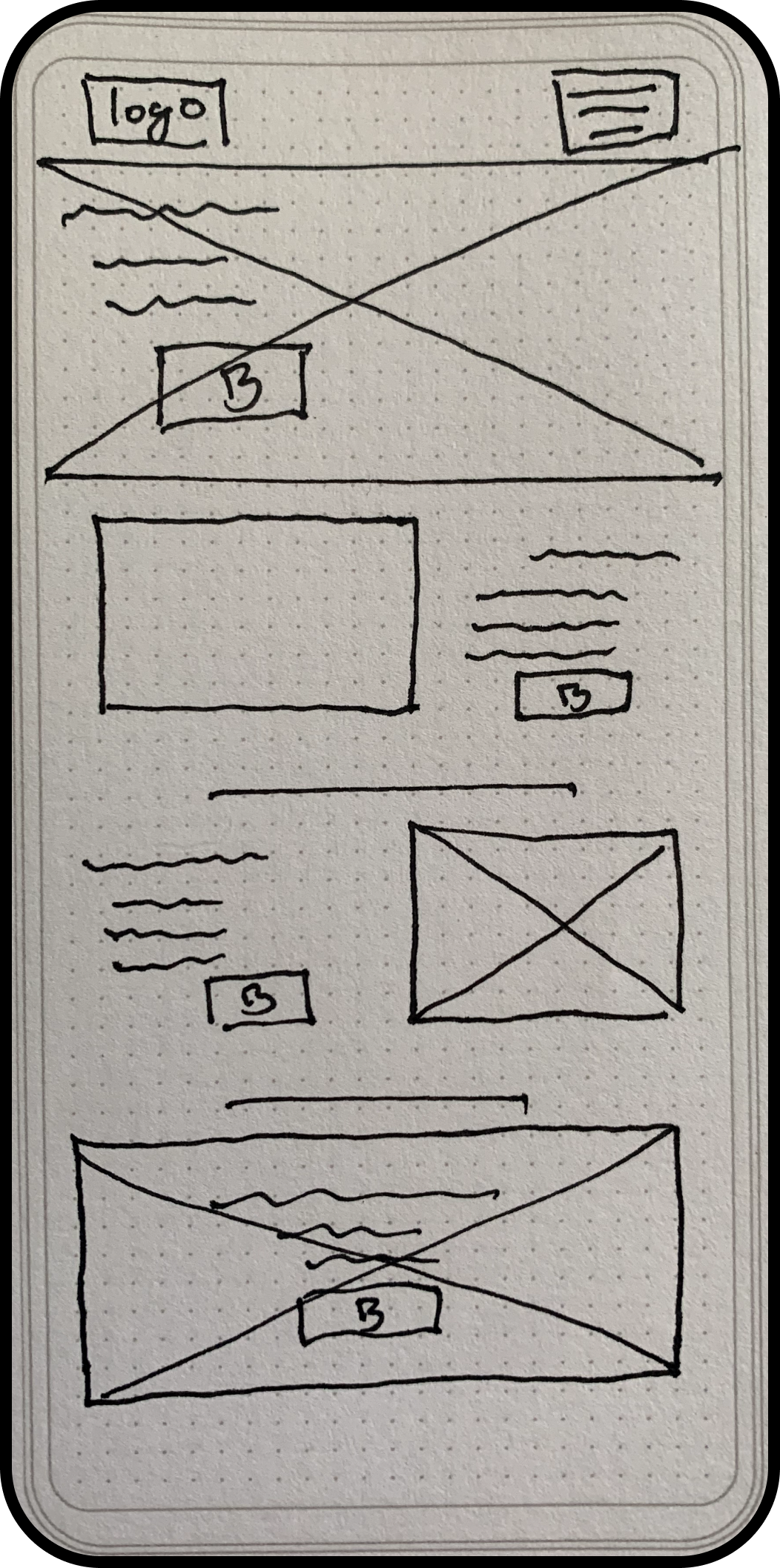
Lo-Fidelity Wireframes
The redesign focused on two key areas: Global & Primary Navigation and information layout. The primary goals were to simplify options, enhance visibility, and provide context to ensure a smooth user experience. By restructuring navigation and reorganizing secondary pages, the redesign aimed to address user confusion and improve information retrieval, while reducing the time on task.

Navigation Solutions
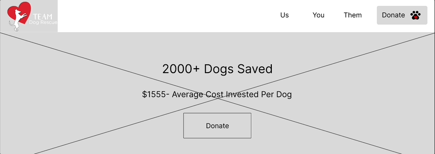

We improved user navigation by implementing a dropdown menu with two options: clicking on primary navigation items or hovering over them for secondary pages. This simplifies navigation, enhances user experience, comparatively to the initial navigation system and frees up the hero space for more relevant information.


We added a search function for users to find pets based on their preferences, as user testing showed this was a priority
The layout was enhanced, ensuring consistent image sizes for a cleaner interface, as there was inconsistency initially, which users felt off-putting.
We improved the Adoptables page by providing essential information about each dog upfront, eliminating the need to open individual profiles.


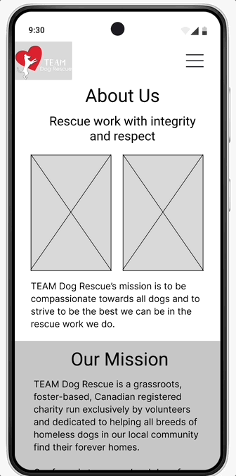
We improved mobile navigation for better accessibility by creating a spacious layout. The updated design ensures consistency between mobile and desktop versions, with each menu item offering access to secondary navigation and the primary page.
Further, we made sure that the donate navigation remains available in every menu to acknowledge its significance to the agency.

To enhance the user experience and improve legibility, we implemented larger and more prominent segments that make it easier for users to locate the desired information. This adjustment ensures that the content is accessible and more readable, aiding users in their search for information.
Prototype
Style Guide
-
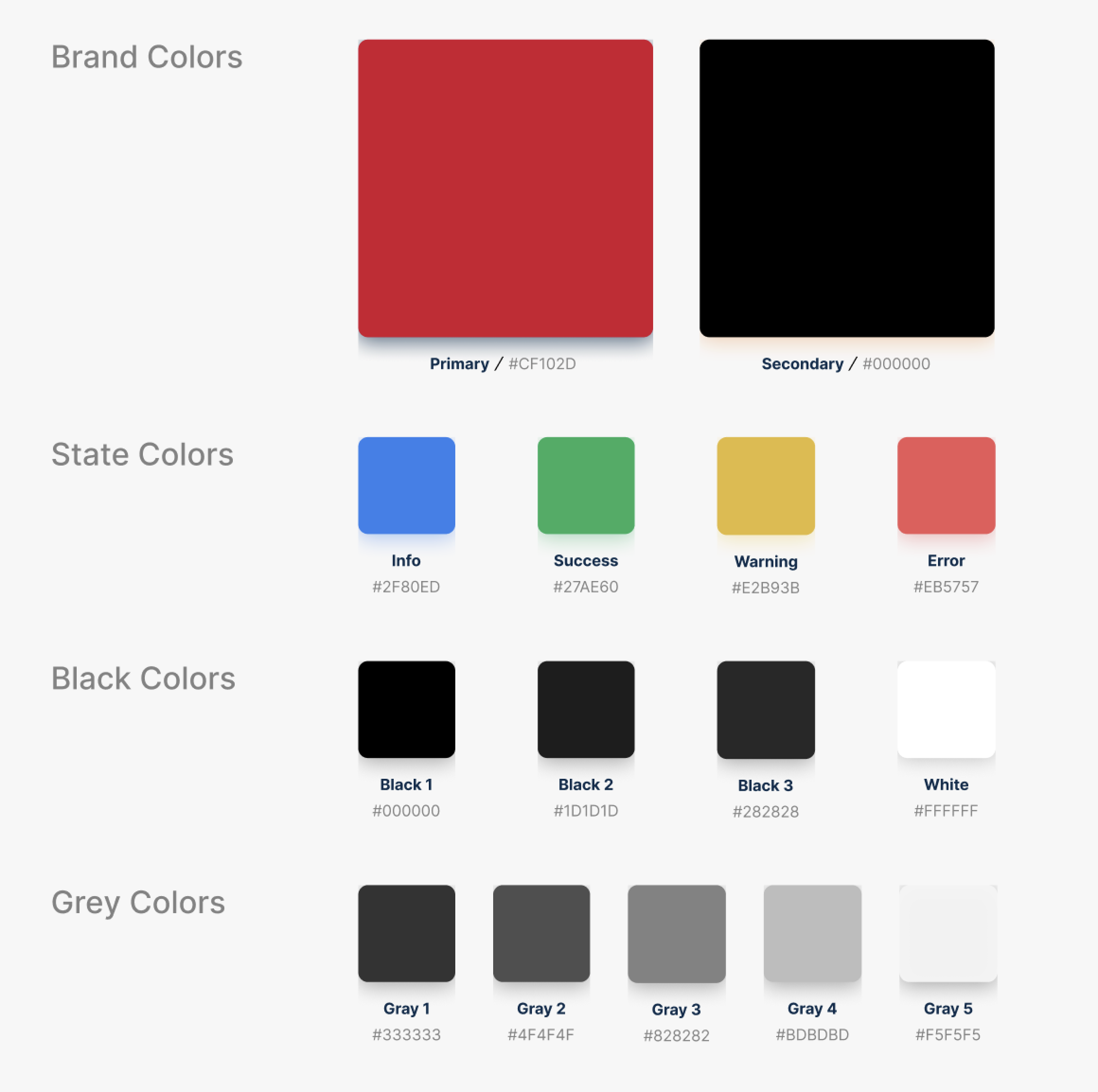
![Colors]()
Colors
-
![Fonts]()
Fonts
-
![Accessibility]()
Accessibility
-
![Navigation]()
Navigation
-
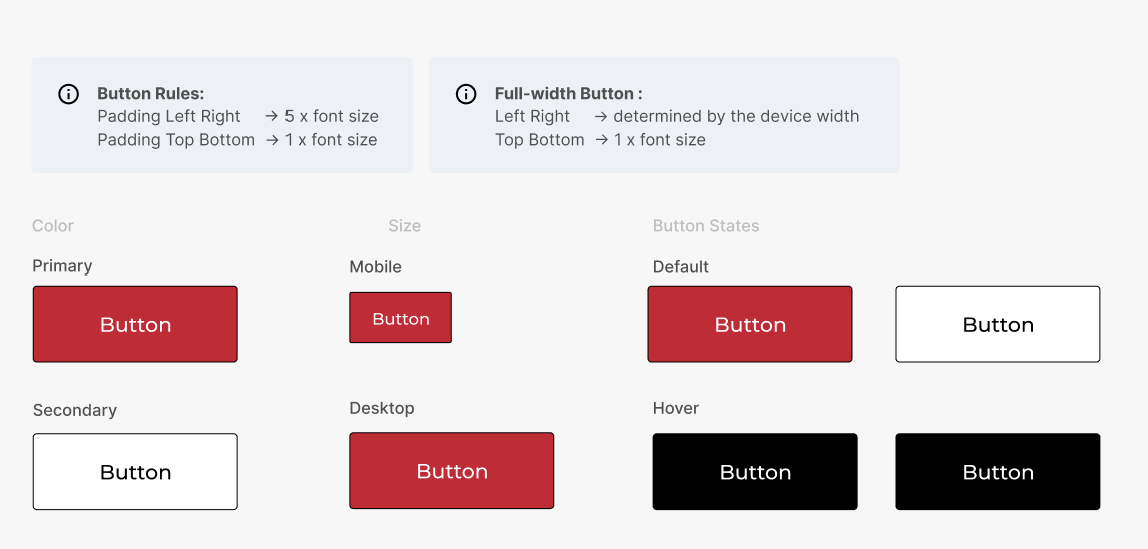
![Button States]()
Button States
-
![Cards]()
Cards


Hi-Fidelity prototype
Mobile
Desktop
Test
Remote moderated testing
In our latest user testing phase, we conducted another round of evaluations with six participants, following the same methodology as previous tests. The evaluation included the utilization of the six familiar tasks, along with the Single Ease Question (SEQ) and System Usability Scale (SUS) to gauge user experience. The testing sessions were conducted under remote moderation.
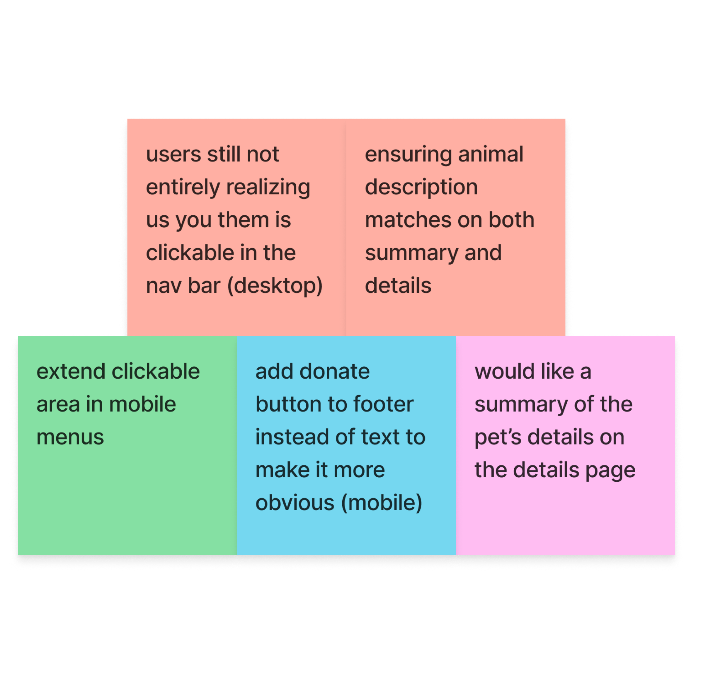
We saw a marked improvement in user ratings and task completion, however, there were some areas of opportunity witnessed. Our team created a prioritzation matrix to asses our next steps.


Iterations

In response to user testing, we updated the dropdown menu titles to turn red when hovered over, indicating that they can be clicked.
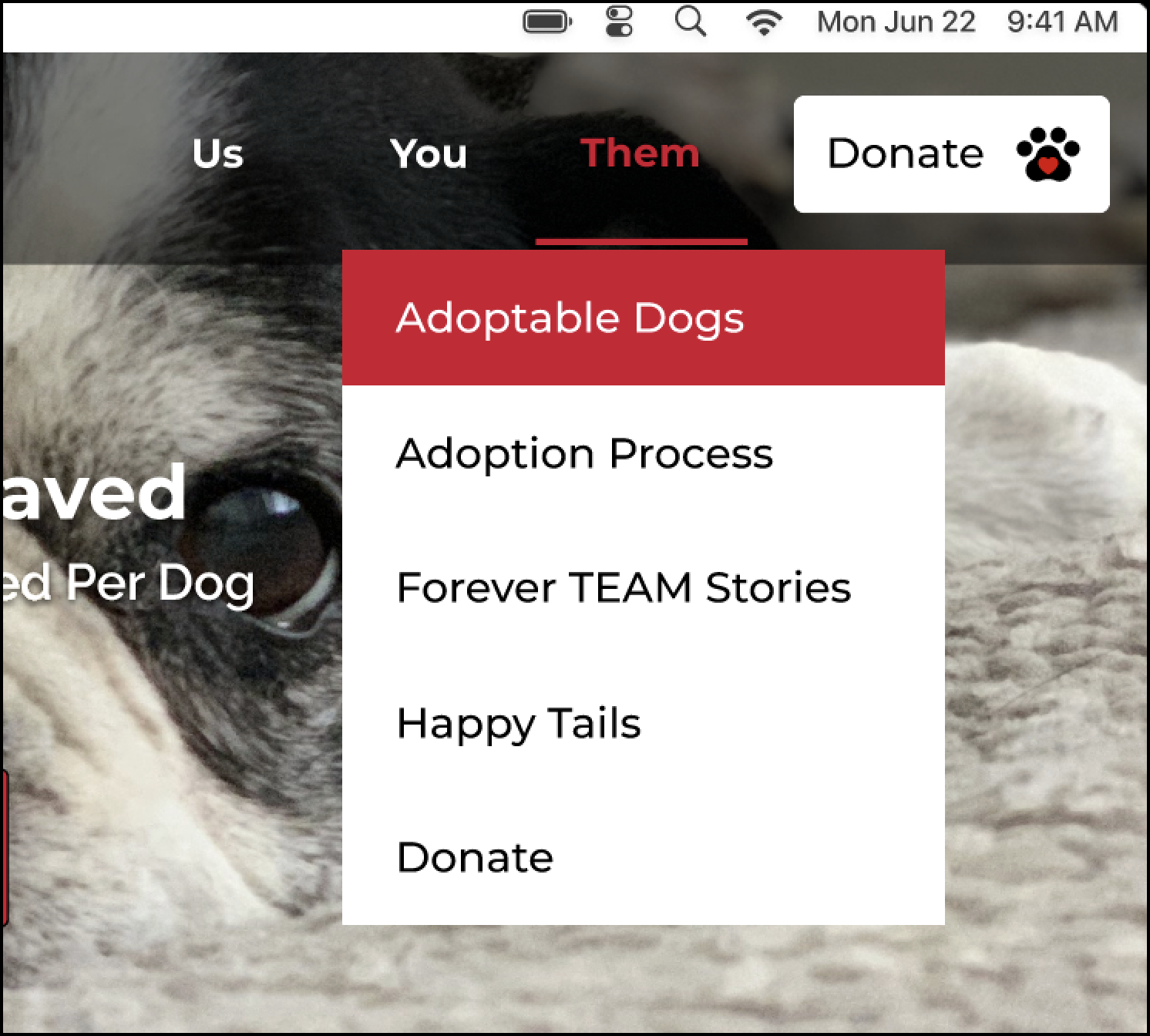
We added the Adoption Process to the Them menu, but also retained it in the You menu to meet user expectations. Offering multiple paths for accessing this important information aligns with the agency's goals.


We enhanced the functionality of the footer while maintaining its simplicity.
We added social media links and changed the color scheme from black to light grey. This prevented the pages from feeling overly heavy, considering the black color used in the global navigation bar.
Our modifications strike a balance between simplicity and visual harmony, ensuring a user-friendly and seamlessly integrated footer design.


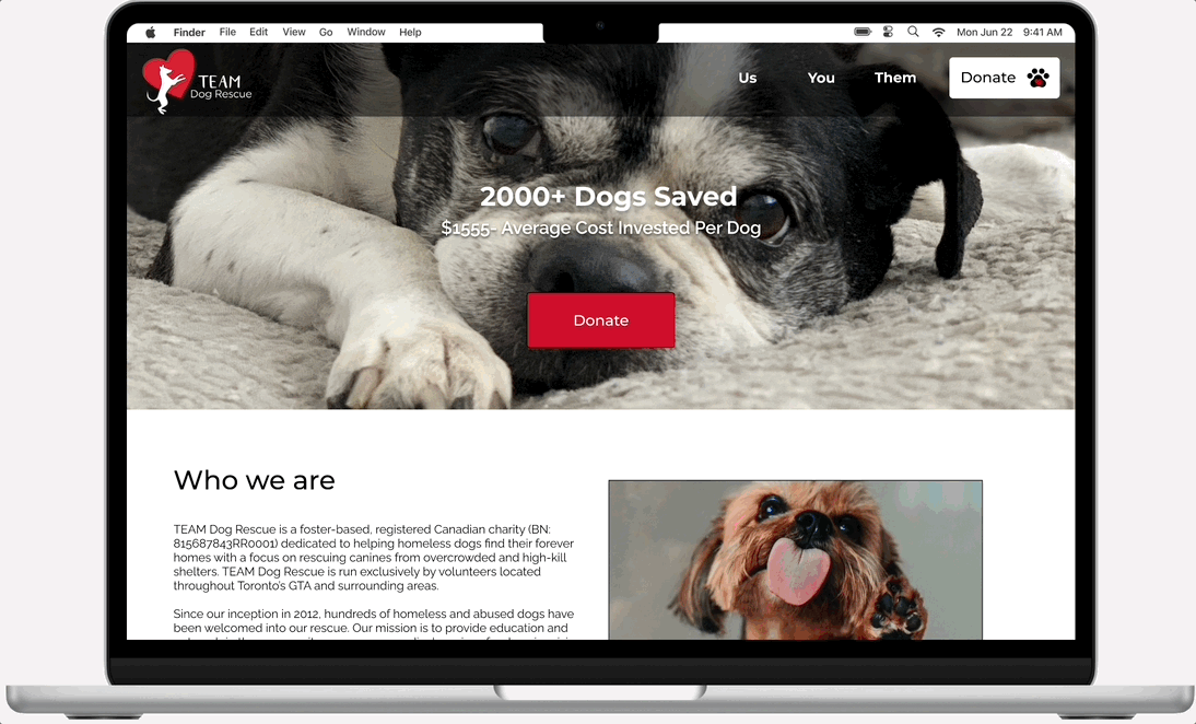
The "Us" page showcases a revamped layout that enhances user experience by effectively organizing information such as "Our Focus”. Through larger titles and strategically varied placement, the page ensures improved readability and digestibility for users.
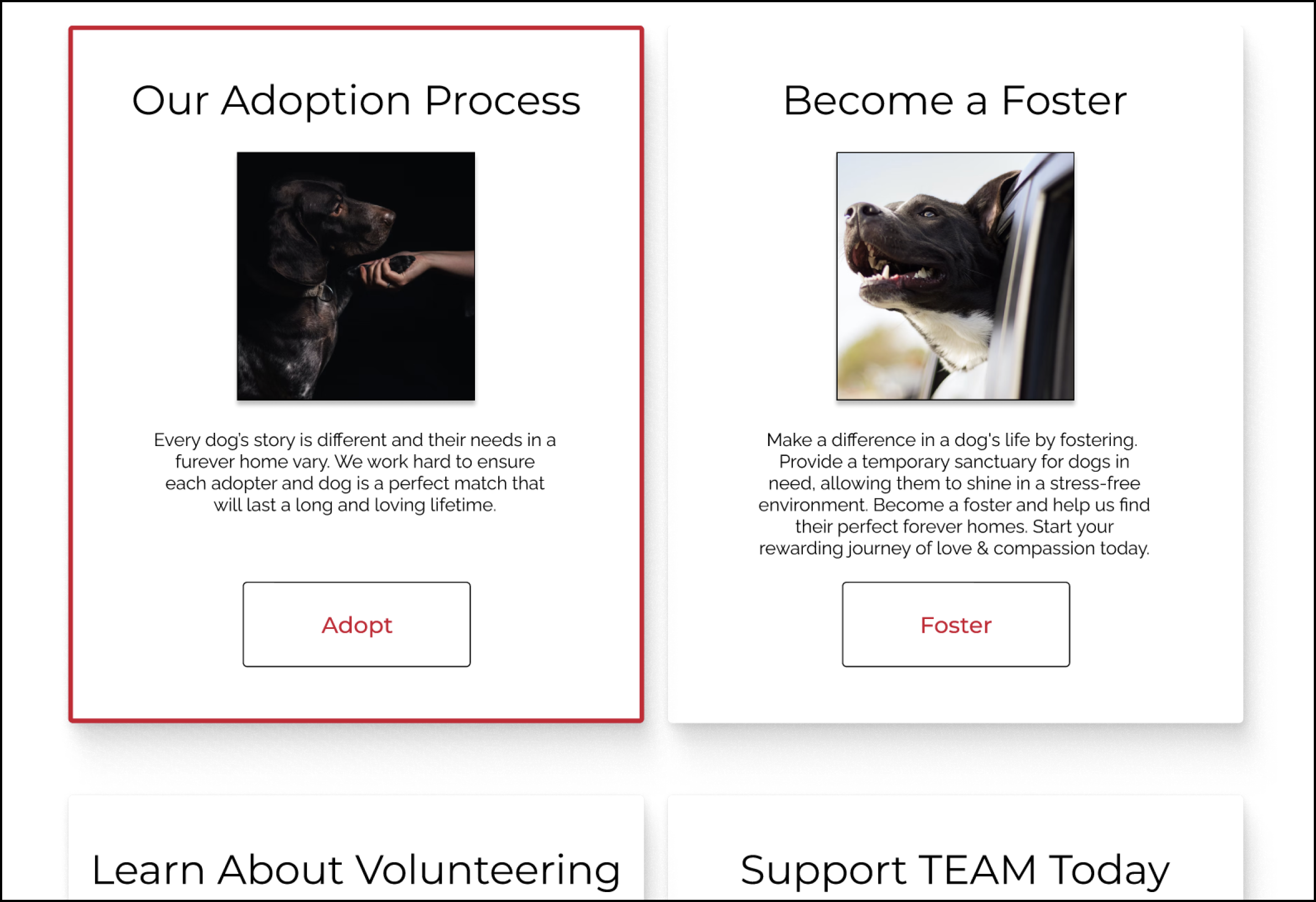

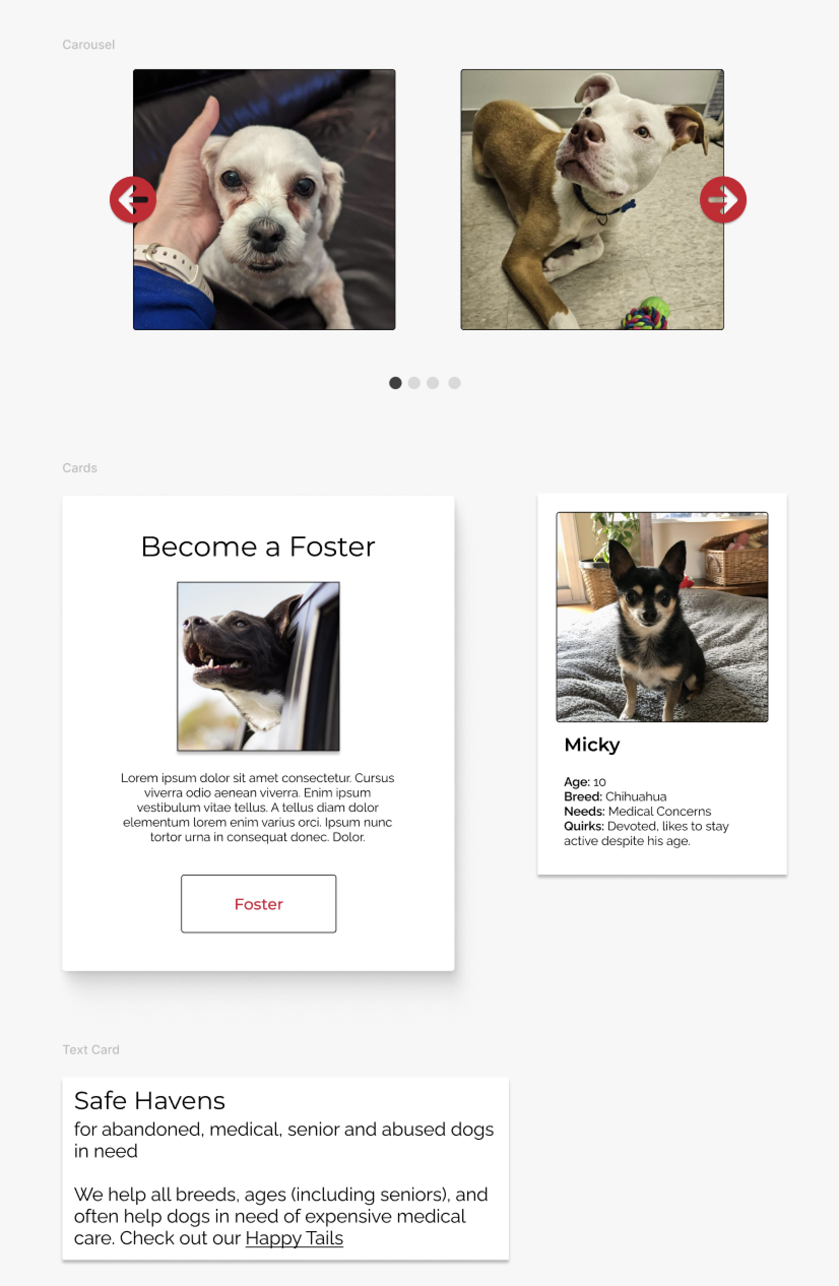
The desktop version of the "You" screen maximizes available space. We introduced cards that retain navigation functionality, showcase additional details, and feature photos. This approach offers a visually enriched interface for users to access comprehensive information.


We improved the appearance of the "Them" screen by introducing a hover stroke around each card, providing a visually engaging effect. Additionally, we included photos of each dog while ensuring consistent sizing across all cards. These enhancements resulted in a cleaner layout compared to the original design.


We made it clear to the development team that the empty photo boxes are intended for additional photos. This clarification ensures that the developers are aware of the purpose and functionality of these elements.
To provide users with a comprehensive understanding of the dog without navigating back, we added additional summary notes on the dog's description page. This eliminates the need for extra effort and allows users to decide if they want to read the complete dog biography.

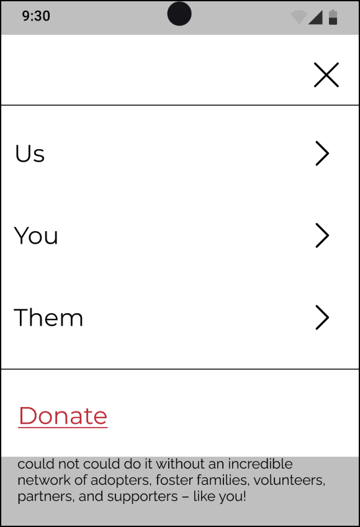


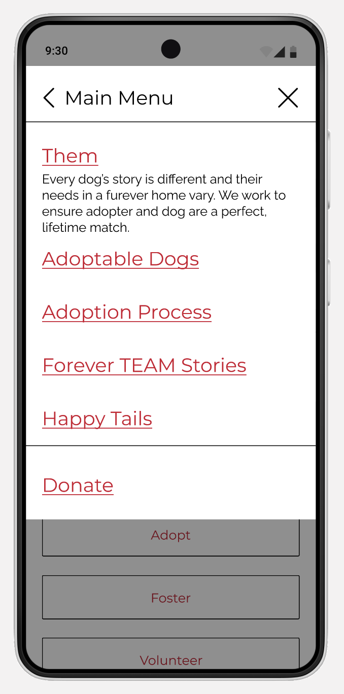
We improved mobile navigation with a hamburger menu, including primary and secondary navigation items for easy access to different sections. Users can return to the main menu or continue viewing the last visited page using the "X" button. Based on user testing feedback, we made UI enhancements to clarify links to pages like "Us," "You," and "Them."


In order to prevent overcrowding of the main navigation header on mobile devices, we made the decision to exclude the donate button. Instead, we chose to replace the existing text link with a donate button in the footer. This adjustment was made to prioritize the visibility of the donation option, which is crucial for the agency.
Future AB testing
Through our final user test, we discovered participants were still struggling somewhat to understand that the “Us”, “You”, and “Them” in the primary navigation on desktop were clickable, not just hover over. We decided to create a second option for our primary and secondary navigation. Our next step would be to conduct AB testing to discover which version of our navigation is most intuitive for users.


We iterated our primary navigation to eliminate the use of dropdown menus for the Us, You, and Them sections. This change improves user-friendliness by making it easier for users to click on the links. Upon reaching each page, users will encounter a secondary navigation bar that displays additional pages.
Final Design
Mobile
Sketch

Lo-fidelity

Final hi-fidelity
Desktop

Sketch

Lo-fidelity

Final hi-fidelity
Final Thoughts

The case study reveals the transformative impact of the website redesign for TEAM Dog Rescue. The comprehensive improvements made to the navigation and layout have resulted in an enhanced user experience. The redesigned website has addressed user pain points and increased usability. The intuitive navigation system allows adopters to easily explore adoptable dogs, find information about the adoption process, and engage with the organization. This seamless user experience is expected to lead to an increase in adoption applications and a boost in donations, as users feel more confident and empowered throughout their journey on the website.

Impact
The redesign of the TEAM Dog Rescue website successfully improved the user experience by enhancing navigation and overall layout, leading to increased usability and reduced user frustration.
Positive outcomes are anticipated, including an increase adoption applications and a boost in donations.
Based on the final round of user testing, substantial progress was observed, with an 11.5% increase in the System Usability Scale (SUS) score and an 12% improvement in the average Single Ease Question (SEQ) score.
Next Steps
Moving forward, the design process will encompass various future steps, including but not limited to:
A/B Testing: Validate design elements through A/B testing, such as drop-down menus, to ensure optimal effectiveness and usability.
Stakeholder Interviews: We were unable to connect with stakeholders for this project. I believe having this resource would’ve added valuable insight to help us refine our solutions. In the future, we would further attempt to gain this perspective.
Iterative Refinements: Continuously improve the website based on user feedback and insights gathered through ongoing user testing.